
Colors
Card, secondary, text and accent colours, gradients, and the global badge tint.
Customize → Colors is where the palette of your profile is defined. Colours are picked with a colour picker or typed as hex values such as #3b82f6.
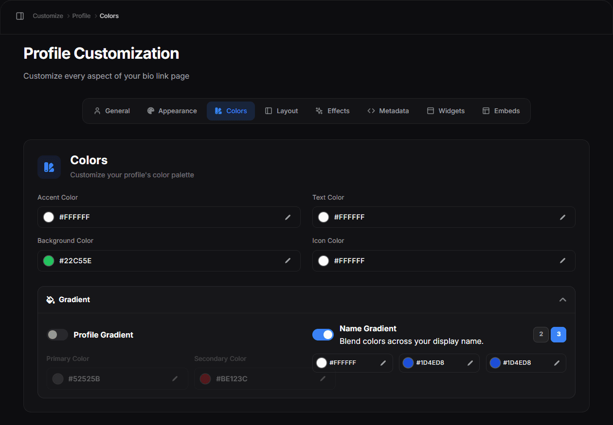
- Accent Color — highlights, icons and interactive states on your profile
- Text Color — your name, bio and link labels
- Background Color — the page behind the card. It is disabled while a custom background image is set — the note under the field says so
- Icon Color — the colour of the social and link icons
Below the four pickers, the Gradient section expands to add a second stop.
The main colours
| Colour | Applies to |
|---|---|
| Card colour | The surface of your profile card |
| Secondary colour | Supporting surfaces and gradient stops |
| Text colour | Your name, bio and link labels |
| Accent colour | Highlights, icons and interactive states |
| Badge colour | A global tint applied to your badges |
Badge tint
System badges are drawn in white by default and tinted globally by the badge colour. That means all badges share one colour — it is a palette control, not a per-badge setting. Set it to a colour that reads clearly against your card, not against your background.
Gradients
Where a gradient is available you set two stops. Gradients with low contrast between the stops look intentional; a hard jump from one hue to a very different one rarely does.
Contrast
The one rule worth following: text must stay readable. Light grey text on a light card is unreadable on a phone in daylight, even if it looks fine on your monitor at night. Check on an actual phone before you commit.
A palette that always works
Pick one accent colour and use it everywhere — links, icons, glow, border. Keep the card and background neutral. Two colours plus neutrals beats six colours every time.
Copying a palette you like
Open a template you admire, apply it, then adjust the colours to your own. Templates carry the full configuration, so this is the fastest way to start from a design that already works.