Appearance
The Appearance tab of the profile editor — colours, fonts, the glassmorphism sliders, glow effects and the display option switches.
Open Customize → Profile → General and pick the Appearance tab at the top. The profile editor has four tabs — General, Appearance, Visuals and Entry — and Appearance holds the look of the card itself.
The tab is a column of separate cards, with the live preview of your profile on the right. From top to bottom: Colors, Fonts, Appearance, Glow Effects and Display Options.
Looking for the avatar decoration, banner or tags?
They moved to the General tab. Your avatar and its decoration, the top-right card decoration, the background, the profile banner, the custom cursor and the audio sit in its Media card; tags close the General Information card. See General.
Colors
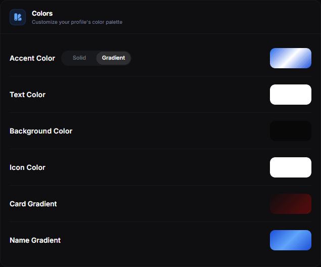
Under the four colours sit two more rows — Card Gradient and Name Gradient. Each one opens its own editor.
The main colours
| Colour | Applies to |
|---|---|
| Accent colour | Highlights, icons and interactive states — a single colour or a gradient |
| Text colour | Your name, bio and link labels |
| Background colour | The page behind the card |
| Icon colour | Your location pin, tag icons, portfolio chips and the music ticker |
Link and social icons have their own colour setting, separate from the one here — see Links.
Gradients
There are three — Card Gradient, Name Gradient and Accent Gradient — each with its own editor, and they are independent of one another.
Card Gradient
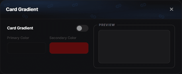
Blends the surface of the profile card between a primary and a secondary colour. Two stops, plus a live preview of the result.
Name Gradient
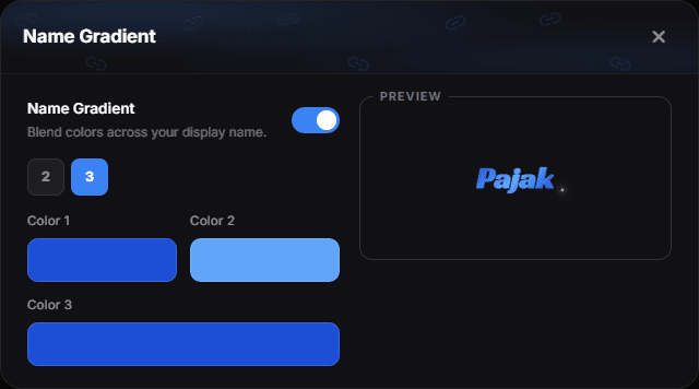
Blends colours across your display name. This one takes two or three stops — the 2 / 3 buttons under the switch decide how many colour rows you get — and previews on your actual name.
Gradients with low contrast between the stops look intentional; a hard jump from one hue to a very different one rarely does.
Accent Gradient
The Accent colour row has its own Solid / Gradient switch — the same kind of switch as Media / Animated next to the background. Choose Gradient and the swatch turns into a gradient tile; click it to open the editor.
The editor works like the name gradient: the 2 / 3 buttons set the number of stops, each stop has its own colour, and the preview tile shows the resulting gradient.
| Where | What the gradient paints |
|---|---|
| Music and audio players | Play buttons, progress bars and the volume slider |
| Click effects | Sparkle and Lightning cycle through its colours |
| Badges and link icons | The whole gradient, when their colour is set to follow the theme |
Anything that can only hold one colour — text selection, glows and the entry gates — takes the first colour of the gradient, so it stays in step with the rest.
Switching back to Solid keeps your gradient colours for later. Templates and your other profiles carry the accent gradient together with the other colours.
Contrast
The one rule worth following: text must stay readable. Light grey text on a light card is unreadable on a phone in daylight, even if it looks fine on your monitor at night. Check on an actual phone before you commit.
A palette that always works
Pick one accent colour and use it everywhere — links, icons, glow, border. Keep the card and background neutral. Two colours plus neutrals beats six colours every time.
Copying a palette you like
Open a template you admire, apply it, then adjust the colours to your own. Templates carry the full configuration, so this is the fastest way to start from a design that already works.
Fonts
The font sets the tone of a profile faster than any colour. flexbio.link ships a curated list of system and web fonts you can apply to your profile text.
Choosing a font
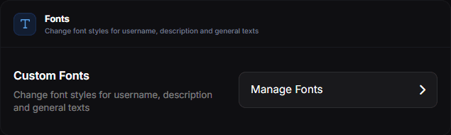
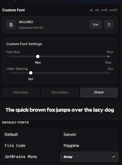
Open Customize → Profile → General, switch to the Appearance tab and click Manage Fonts in the Fonts card. Pick from the list. Every font is rendered in its own typeface, and the sentence above the grid previews your current choice.
You also decide where the font applies — Username, Description or Global — and can fine-tune Font Size and Letter Spacing with the sliders. If none of the built-in fonts fit, upload your own .ttf, .otf, .woff or .woff2 file.
What to consider
- Readability first. A display font that looks great at 40px can be unreadable at 14px in a bio.
- Language coverage. If your bio uses Polish, Turkish, Russian, Ukrainian or Arabic characters, confirm the font actually renders them; a font without those glyphs falls back mid-sentence and looks broken.
- Weight. Very thin weights disappear on bright backgrounds and on low-brightness phone screens.
Pairing with effects
Text effects and heavy display fonts compete with each other. A neutral font with one strong effect, or a characterful font with no effect, both look deliberate. Both at once rarely does.
Preview any font with your own text in the Playground before applying it — including your longest link label, which is where cramped fonts fail.
Fallbacks
If a font cannot load on a visitor's device, the browser substitutes the nearest available one. That is normal and cannot be prevented; it is another reason not to depend on an exotic font for legibility.
Appearance
Four sliders that fine-tune the glassmorphism of the card.
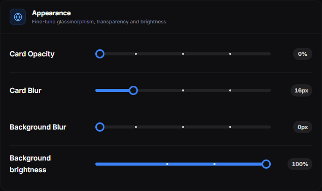
- Card Opacity — how solid the card surface is — 0% leaves only the blur
- Card Blur — the frosted-glass blur of the card itself
- Background Blur — blurs what sits behind the card
- Background brightness — dims or lifts the background; 100% leaves it untouched
How wide the card is — and how large the whole profile is drawn — does not live here: that is Content width and Profile zoom, in Layout.
Glow Effects
Three independent switches that add a glow to separate parts of the profile.
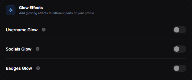
| Switch | What it lights up |
|---|---|
| Username Glow | Your display name |
| Socials Glow | The social icon row |
| Badges Glow | The badge row |
Badges Glow works independently of the badge colour and shimmer settings in Badges, so badges can still look lit up with those turned off.
Display Options
Toggles for UI elements on the profile. The ? next to each name shows a short hint.
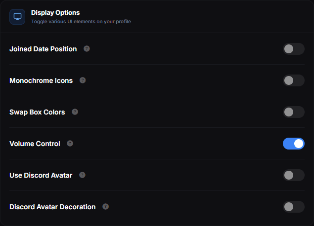
| Switch | What it does |
|---|---|
| Joined Date Position | Displays when you joined, under your tags |
| Monochrome Icons | Renders the social icons in a single colour |
| Swap Box Colors | Swaps the primary and secondary box colours |
| Volume Control | Shows the volume slider on the audio player |
| Use Discord Avatar | Uses your Discord avatar as your profile picture |
| Discord Avatar Decoration | Shows your Discord avatar decoration on the profile |
Where exactly the join date is placed is picked in Layout under Joined Date Position. The last two switches need a connected Discord account.
Card and border effects are in Visuals
Profile Card Effects (3D Tilt, Hover Depth, Floating Depth, Glare) and Card Border Effect are not in this tab — they sit in the Visuals tab, described in Visuals.
Preview before you save
The preview beside the cards updates as you change values, but hover-based effects are easiest to judge on the real page — open View Profile. To experiment without touching your live profile, use the Playground.