
General
The General tab — display name, location, bio, tags, avatar and its decoration, top-right decoration, background, banner, cursor and audio.
Customize → Profile → General opens the profile editor on its first tab, General. It holds the content a visitor reads first and the media your profile is built from. The styling of it lives in the other tabs — Appearance, Visuals and Entry.
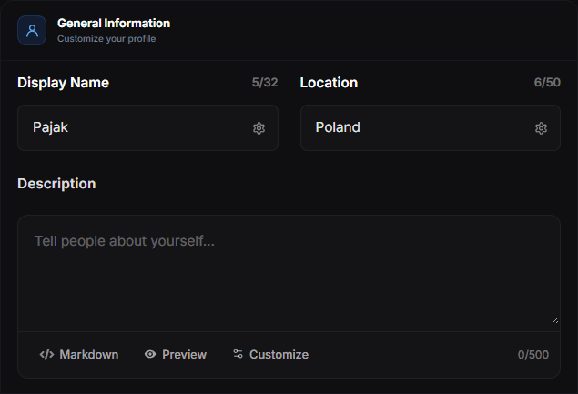
The tab has two cards: General Information and Media.
General Information
Display name
The large name on your card, up to 32 characters — the counter above the field tracks it. It can differ from your username and may contain spaces and symbols. If you leave it empty, your username is shown instead.
The gear icon inside the field opens the text effects for your name.
Location
An optional place shown on the profile, up to 50 characters. Where it sits on the card is chosen in Layout under Location Position.
Description
Your bio, up to 500 characters. Markdown is supported — the toolbar under the field switches between Markdown help, Preview and Customize, which opens the text effects for the description.
One or two lines works best — anything longer pushes your links out of the first screen on mobile.
Tags
Short labels shown on your profile — a role, a city, a mood. Up to six, each with an optional icon. Use Add Tag to create one; each tag can be moved up or down, hidden, edited or deleted.
Media
Profile avatar
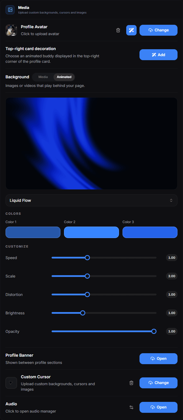
Click the avatar to upload a picture, or Change to replace it. Very wide or very tall images are cropped to fit the frame — the cropper lets you zoom out so the whole photo is visible. Animated formats are supported where the platform allows them.
Avatar decoration
An avatar decoration is drawn over your profile picture. The picker has two tabs. All is the whole gallery, a page at a time, with a search box above it. Colors narrows that same gallery to one colour: pick a chip and you get the decorations whose artwork is mostly that colour. Your own avatar sits in the middle of every tile, so what you see is the decoration on your picture, not on a stand-in.
The Colors tab also carries four decorations drawn in code instead of painted into a file: Electric, Stars, Glow and Pulsing Glow. They take the colour chip you picked and follow your avatar's shape — circle, rounded or square.
An avatar wears one decoration at a time. Choosing one of these effects clears the image decoration, and choosing an image clears the effect.
Discord can override this
If Discord Avatar Decoration is on in Display Options, your Discord decoration wins and the one chosen here is ignored.
Top-right card decoration
An animated buddy pinned to the top-right corner of the profile card. Add or Change opens the same gallery as the avatar decoration — the same All and Colors tabs and search — without the avatar preview and without the code-drawn effects, which belong to the avatar. The same gallery is in the Playground under Top Right Decoration.
Background
What plays behind your whole page. The switch on the row picks one of two sources:
- Media — your own images or videos. The button opens the Background manager, where you can keep up to 3 backgrounds on one profile. PNG, JPG, GIF and WebP images are supported, as are MP4, WebM and MOV videos. With more than one, they play as a carousel: give each a name and drag them into the order you want.
- Animated — a configurable shader background such as Aurora, Silk, Plasma, Liquid Flow, Metallic Swirl, Neural Tunnel, Spectral Clouds, Meteors or Lightspeed. Its Colors and sliders (speed, scale, brightness, opacity and more, depending on the effect) open directly under the row.
All animated backgrounds available under Animated:
| Background | What it looks like |
|---|---|
| Lightfall | Soft falling streaks of light |
| Ferrofluid | Liquid metal spikes that flow and react |
| Hyperspeed | Endless neon highway rushing past |
| Aurora | Flowing aurora gradient across the full background |
| Dither | Retro dithered waves |
| Strands | Glowing flowing strands of light |
| Light Rays | Cinematic light rays from above |
| Silk | Smooth silky shader waves |
| Plasma Wave | Three glowing plasma tubes weaving through space |
| Plasma | Swirling plasma glow shader |
| Floating Lines | Wavy glowing lines drifting across the background |
| Color Bends | Wavy glowing colour bands warping across the background |
| Liquid Flow | A flowing liquid gradient rippling across the background |
| Metallic Swirl | A swirling metallic shimmer across the background |
| Mosaic Waves | A tiled grid of squares or dots lit by rolling waves |
| Neural Tunnel | An endless tunnel of layered neon lattices |
| Spectral Clouds | Soft volumetric clouds drifting through a spectral glow |
| Rain v2 | Falling rain across 3 depth layers with an occasional soft screen flash |
| Chroma Waves | Radial chroma-shifted wave bands rippling across the background |
| Meteors | Streaking meteors with a glowing gradient tail |
| Lightspeed | A radial streak tunnel racing outward |
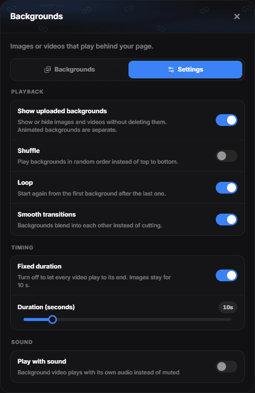
The manager's Settings tab controls the media carousel in three groups:
- Playback
- Show uploaded backgrounds — shows or hides your images and videos without deleting them. Animated backgrounds are separate and are not affected.
- Shuffle — plays the backgrounds in random order instead of top to bottom.
- Loop — starts again from the first background after the last one instead of stopping.
- Smooth transitions — the next background fades in over the current one, and a video's sound fades with it. Off, it cuts straight to the next one. Either way the old background stays until the new one has loaded, so there is never a black frame.
- Timing
- Fixed duration — how long each background is shown, from 3 to 60 seconds (default 10). Turn it off to let every video play to its end before the next one starts; images then stay for 10 seconds.
- Sound
- Play with sound — the background video plays with its own audio instead of muted. Music from the Audio Manager takes priority: while the audio player is on and a track is enabled, the video stays silent.
One background needs no settings
With a single background the carousel never advances, so Shuffle, Loop, Smooth transitions and the duration have nothing to do. They start mattering from the second one.
How the background is rendered — its blur and brightness — is set in Appearance. Overlays such as Snowflakes or Matrix, and Page FX, are in the Visuals tab — see Visuals.
Profile banner
A wide image shown between profile sections. Use something with low detail — busy banners fight with your avatar and name.
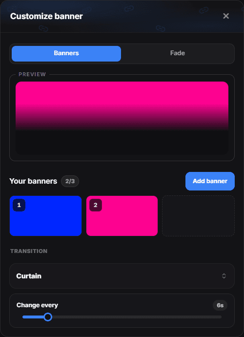
Open on the banner row opens Customize banner, where one profile can have up to 3 banners that take turns. Two tabs sit above a live preview:
- Banners — your banners as numbered tiles, in the order they play. Add banner adds the next one; hover a tile to replace it (pencil) or remove it (bin). Adding and removing are saved at once. With two or more banners, choose a Transition and set Change every from 3 to 30 seconds (default 6).
- Fade — the Fade Effect slider, which sets how softly the bottom edge of the banners blends into the card. 0% leaves them without a fade, 100% fades them from the very top, and the default 70% is the look banners have always had.
| Transition | What it looks like |
|---|---|
| Smooth | The next banner blends in over the current one |
| Diagonal | A soft edge sweeps from the top-left to the bottom-right corner |
| Slide | The next banner slides in from the right and pushes the old one out |
| Circle | A soft circle grows from the center |
| Curtain | The next banner opens from the center to both sides |
| Hologram | The next banner flickers in as a cyan hologram with scanlines |
| Shockwave | A ring of light bursts from the center and reveals the next banner |
| Rise | The next banner rises from the bottom through a soft mask |
Transition, Change every and the fade are saved with Save in the bar at the bottom. The switch on the banner row hides every banner without deleting it; the bin next to it removes them all.
In the Tabs layout the banner is shown without a fade, so the slider has no effect there.
Custom cursor
Replaces the mouse pointer on your profile with an image of your own. For animated cursor effects, see Visuals.
Audio
Opens the audio manager for the music that plays on your profile. See Music.
Fill the content first and style afterwards. A design that looks right with placeholder text often breaks once the real bio is three times longer.
Signature and view counter
The signature shown under the profile card, and where the view counter sits (Profile Views Position), are both set in Layout. Turning the counter off does not stop view tracking; Analytics keeps recording either way.