
Links
Adding, ordering, grouping, styling and deleting the link buttons on your profile.
Customize → Links manages the buttons on your profile. Each link has a title, a destination URL, an optional icon and a display style.
Add a link
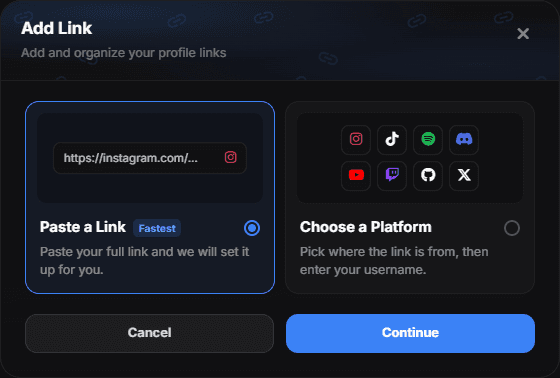
Add Link opens a short wizard. The first screen asks how you want to start:
- Paste a Link — marked Fastest. You already have the URL; paste it and the icon and title are filled in for you when the platform is recognised.
- Choose a Platform — you know the service but not the full URL. Pick it from the grid and you only type your username; the rest of the address is added for you.
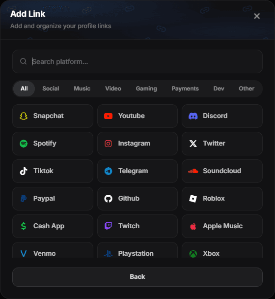
Picking Choose a Platform opens a searchable grid. The search matches the platform name, its slug and common nicknames, so "yt", "ig" and "bnb" all find their platform. Selecting one sets the icon, the title and the right behaviour in a single step, then drops you into the editor with the address prefix already applied.
Crypto and email are not ordinary links
Wallet platforms are set to copy instead of open — the button copies the address to the clipboard, because a wallet address is not a web address. Email is set to open a mail client. You can override this under Behavior if you need to.
The link editor
Both paths end at the same editor, and the same editor opens again when you edit an existing link. A live preview sits at the top and updates as you type; below it are three tabs: Content, Style and Tags.
Content
Where the link goes.
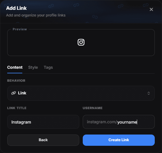
- Behavior — Link opens the destination, Copy puts text on the clipboard, Mail opens a mail client, Text shows plain copyable text.
- Link Title — the label on the button.
- URL — the destination. When you came in through Choose a Platform, the prefix is already there and you only add the part that identifies you.
Style
How it looks.
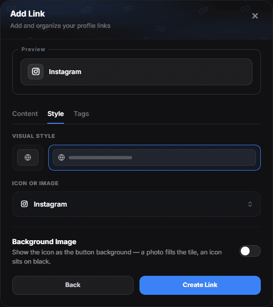
- Visual style — the left tile renders the link as a compact glyph in the icon row; the right one as a full-width button with the title next to it.
- Icon or Image — the glyph. Choose from the catalog, search thousands of Iconify icons, or upload your own image.
- Background Image — see below.
Background Image
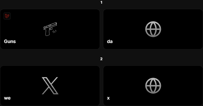
This turns the icon into the button's backdrop instead of a small glyph beside the title. The button becomes a tall tile with the title over the bottom edge.
It works with any icon:
- An uploaded image or photo fills the whole tile.
- An icon — from the catalog or Iconify — is centred on a black tile, because a glyph has nothing to stretch.
- If an image cannot be loaded, the tile stays black rather than showing a broken image.
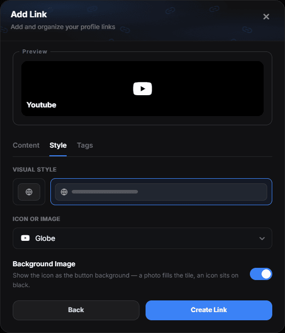
Buttons only
Background Image needs the Button visual style. In the icon style there is no tile to fill, so the switch stays disabled and tells you so.
Tags
Small labels in the top-left corner of a button — up to six per link. Each tag has an icon and optional text: NEW, 18+, a country flag, a price.
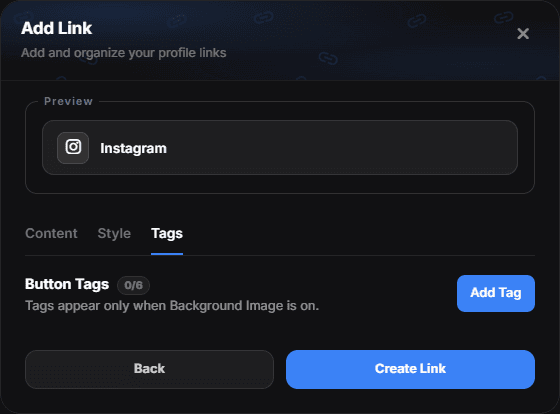
Tags are drawn on the background tile, so they appear only when Background Image is on — a plain button has no room for them.
Button look
Links shown as buttons share one look, set in Customize → Button. The preview at the top of the tab shows every change straight away.
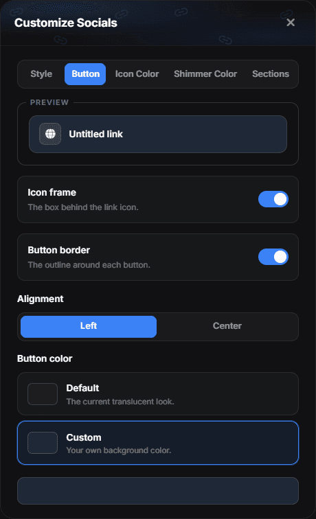
- Icon frame — the square box behind the link icon. Turn it off for a bare icon.
- Button border — the outline around each button.
- Alignment — icon and title on the Left, or in the Center of the button.
- Button color — Default keeps the translucent look; Custom fills every button with a colour of your own, slightly lighter on hover.
Changes save as soon as you make them, and the preview in the link editor uses the same look. Buttons with Background Image on keep their own tile look.
Sections
Buttons can be grouped under headings. Open Customize → Sections, add a section, name it, and tick the links that belong to it.
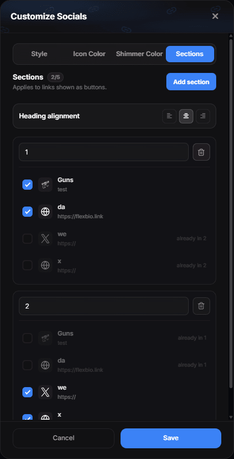
- Up to five sections, names up to 40 characters.
- A link belongs to at most one section. If you tick a link that already sits elsewhere, the dialog says which section holds it.
- The heading appears above the first button of that section, in your existing link order — sections label your order, they do not reorder anything.
- Sections apply to links shown as buttons. Links displayed as icons ignore them.
Heading alignment — the three buttons at the top of the tab put the section headings on the left, in the centre or on the right. It is one setting for all of them: different alignments down a single column read as a typesetting mistake rather than a choice.
Headings also join the Parallax profile animation with their own group, so a section title and the buttons under it arrive together instead of the title sitting still while the buttons slide in.
Icon color
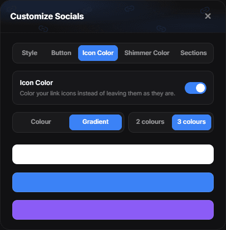
The Customize button at the top of the Links page opens a dialog with five tabs — Style, Button, Icon Color, Shimmer Color and Sections. Icon Color decides where your link icons take their color from.
| Mode | What it does |
|---|---|
| Theme | Every icon takes your profile's accent color |
| Platform | Each service gets its own brand color — Discord blurple, Spotify green, YouTube red. Anything without a brand color falls back to your custom swatch |
| Custom | One color for every icon |
In Custom you also choose how that color is painted: Colour is a single flat tone, Gradient blends two or three colors across each icon. The gradient is applied per icon, not once across the whole row, so every icon carries the full blend.
The swatch here belongs to your links only. The icon color in Colors is a different setting — it paints your location pin, tag icons, portfolio chips and the music ticker. Changing one no longer touches the other.
Icon shimmer
The Shimmer Color tab adds a highlight that travels along your icons, one after another. It works together with the socials glow — they use different properties, so you can run both at once.
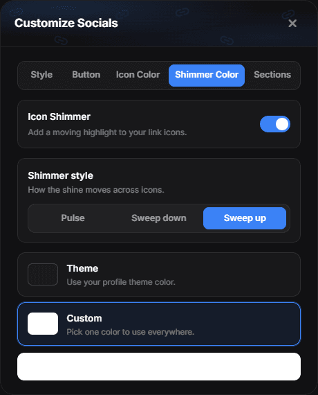
Shimmer style picks how the shine moves:
- Pulse — the highlight brightens across the icon and fades, in place.
- Sweep down — the highlight travels down through the icon on a diagonal.
- Sweep up — the same diagonal highlight, travelling up through the icon.
With Monochrome icons on as well, the shimmer becomes a brightness sweep instead of a color one — grayscale removes the hue a colored wave would need, so the icons stay gray and the highlight still travels.
One link at a time
Each link can also have a look of its own. Open the ⋯ menu on a link row and pick the paintbrush — Customize: … opens with the link's title and the same two tabs as the Customize dialog above.

- Icon Color — the Icon Color switch, then Theme, Platform (the service's own colour where one is known) or Custom.
- Shimmer Color — the Icon Shimmer switch and a Theme or Custom shimmer colour.
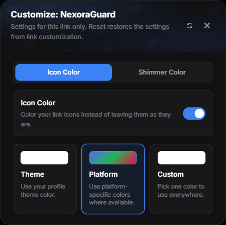
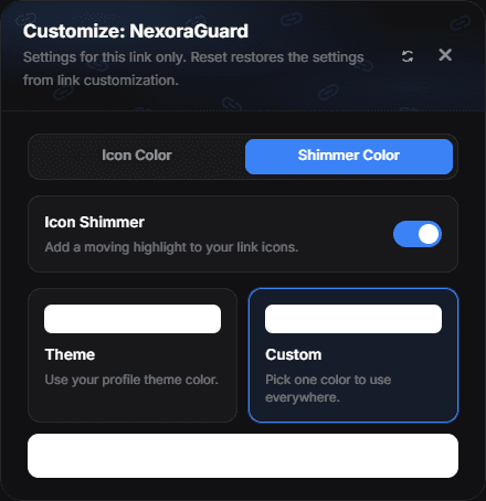
The window starts from your global link settings, and every change applies to this link only, whatever the global mode says. Once the link has settings of its own, a reset icon appears next to the title and hands it back to the global settings.
Uploaded images
An icon you uploaded yourself keeps its own artwork until you actually ask for a color — either by turning the Icon Color switch on, or by painting that one link. Coloring it flattens the whole image to a single color, which is what "icon color" means for a logo.
Order
Drag links to reorder them. Order matters more than most people think: the first two buttons take the majority of clicks, and everything below the first screen takes very few.
Titles that work
- Say where the button goes: "Commissions", "My Twitch", "Discord server".
- Avoid "Click here" and bare URLs as titles.
- Keep them short — long titles wrap onto two lines on phones.
Deleting
Use the trash button on a link row. Deletion is immediate and cannot be undone; the link is simply removed, your other links keep their order.
Links vs socials
Use Links for destinations that need a label. Use Socials for platforms with a recognisable logo — those render as compact icons and take far less vertical space.
Which links get clicked?
Analytics shows your most clicked socials, so you can promote what people actually use and drop what nobody touches.