
Fonts
Choosing a profile font, how fonts affect readability, and which combinations to avoid.
The font sets the tone of a profile faster than any colour. flexbio.link ships a curated list of system and web fonts you can apply to your profile text.
Choosing a font
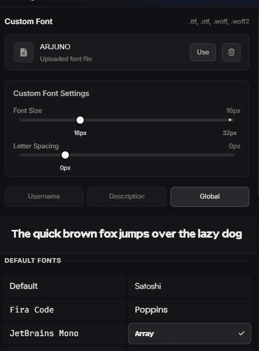
Open Customize → Appearance → Custom Fonts and pick from the list. Every font is rendered in its own typeface, and the sentence above the grid previews your current choice.
You also decide where the font applies — Username, Description or Global — and can fine-tune Font Size and Letter Spacing with the sliders. If none of the built-in fonts fit, upload your own .ttf, .otf, .woff or .woff2 file.
What to consider
- Readability first. A display font that looks great at 40px can be unreadable at 14px in a bio.
- Language coverage. If your bio uses Polish, Turkish, Russian, Ukrainian or Arabic characters, confirm the font actually renders them; a font without those glyphs falls back mid-sentence and looks broken.
- Weight. Very thin weights disappear on bright backgrounds and on low-brightness phone screens.
Pairing with effects
Text effects and heavy display fonts compete with each other. A neutral font with one strong effect, or a characterful font with no effect, both look deliberate. Both at once rarely does.
Preview any font with your own text in the Playground before applying it — including your longest link label, which is where cramped fonts fail.
Fallbacks
If a font cannot load on a visitor's device, the browser substitutes the nearest available one. That is normal and cannot be prevented; it is another reason not to depend on an exotic font for legibility.