
Layout
Layouts, section order, width, zoom, spacing and alignment — how the parts of your profile are arranged.
Customize → Profile → Layout decides what appears on your profile and in which order. The content itself comes from the other customization sections; layout only arranges it.
Choosing a layout
The layout carousel at the top picks the overall shape of the profile. Eight are available:
| Layout | What it gives you |
|---|---|
| Horizontal | Avatar left, profile info on the right. The default. |
| Horizontal Right | The mirror image — avatar right, info on the left. |
| Vertical | Avatar above the name, everything stacked and centred. |
| Elevated | The avatar is lifted above the top edge of the card as a raised tile. |
| Open Widgets | Discord, music and widgets live outside the card instead of inside it. |
| Tabs | One card with switchable tabs. |
| Sidebar | A fixed side card with switchable sections next to the main content. |
| Portfolio | About, languages, widgets and a project showcase — a page rather than a card. |
Switching layout never deletes anything. Content a layout has no place for is simply not drawn, and comes back when you switch to a layout that shows it.
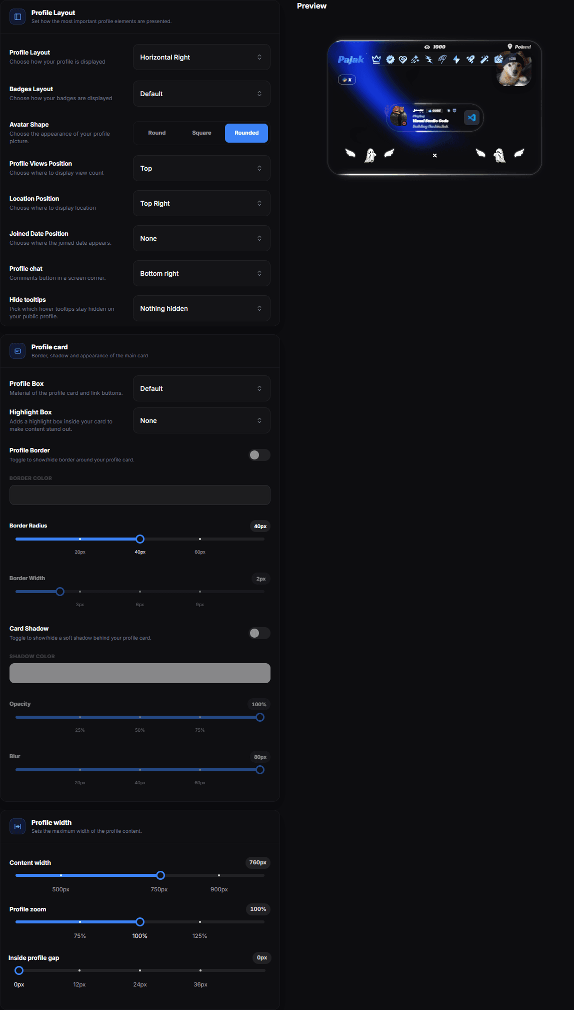
Under the layout itself the same card carries Avatar Shape, Badges Layout, the positions for the view counter, the location line and the joined date, the corner of the Profile chat button and Hide tooltips.
Section order
There is no separate section-order screen. Where a layout has orderable sections, the list that defines them is the order:
- Portfolio — the module list under Portfolio. Add, drag and hide modules there; the order of the list is the order of the page.
- Sidebar — the section list for the side card, in the same place.
Everything else is arranged by the layout you picked, not by a list you sort.
Content width
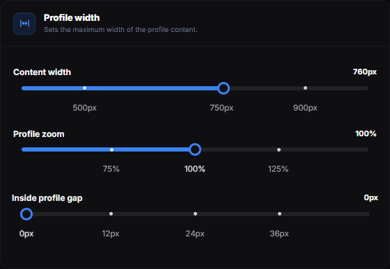
The Profile width card sets how wide the profile's content column is allowed to grow — anywhere from 350px to 1050px, with 750px as the default.
A narrow column suits a short profile with a couple of links — it keeps everything within one glance instead of stretching a few items across a wide card. A wide column earns its keep once you have several widgets side by side.
Two things adapt themselves to the width you choose, so nothing overflows:
- The badge capsule pages fewer badges at a time and moves the rest behind its › arrow.
- Widgets that no longer fit side by side stack and stay centred in the card.
Phones ignore the upper end
On a phone the column is capped regardless of this setting, so raising it changes nothing there. Lowering it below the phone cap does carry over.
Profile zoom
Profile zoom scales the whole profile like a camera — the card, its text, avatar, badges, links and widgets all grow or shrink together, keeping their proportions. It runs from 50% to 150%, with snap points at 75%, 100% and 125%; 100% is the size profiles have always had.
Only the profile content is zoomed. The background, the entry gate and anything fixed to the screen keep covering the whole window.
Use it when the design is right but reads too small or too large on screen — instead of raising every font size and the content width one by one.
Zoom versus width
Content width gives the content more room but keeps everything the same size. Profile zoom keeps the layout and makes everything bigger. A zoomed-in profile also takes up more width, so check the result on a smaller laptop screen.
Inside profile gap
Under the zoom slider, Inside profile gap adds vertical breathing room between the rows of the card — the header, the links, the widgets, the stats. It runs from 0px to 48px and starts at 0, which is the spacing the profile has always had.
The dot at 0 marks the default: while the slider sits there it hides under the handle, and once you move away it shows you where to return to.
This is extra space on top of the spacing each row already carries, so small values go a long way. A few pixels loosen a dense profile; anything above roughly 24px starts to read as gaps rather than rhythm.
Reach for width first
If the card feels cramped, widening the column usually fixes it more cleanly than pushing the rows apart. Use the gap when the width is already right and the rows still sit on top of each other.
Tabs
The Tabs layout groups content into one card with a tab bar at the top instead of one long column. The standard tabs are:
- About — your bio and details
- Socials — your social icons
- Widgets — your live cards
Each tab carries a Name, an optional Icon picked from the same icon library as link tags, and a Description.
Tabs keep a busy profile short. A profile with three links and one widget does not need them.
A banner in this layout sits behind the header rather than as a band above it, and it grows with the header — a long bio pushes the header down and the banner follows, so no gap opens between the photo and the divider under it.
Avatar position in Tabs
Tabs offers left and right for the avatar, but not centre. If you set centre in a layout that does offer it, Tabs falls back to left rather than centring a header it was not designed to centre.
Open Widgets
Open Widgets takes the Discord card, the music player and your widgets out of the profile card and lays them out around it. The card keeps your avatar, name, badges and links; everything live sits beside or below it as its own tile.
It suits a profile with several widgets you actually want people to read — inside a card they compete with your links for the same column. With one or two widgets it mostly adds empty space.
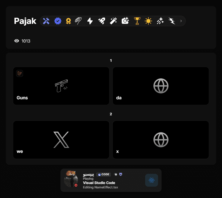
Because there is no single painted card, card-level effects are applied to each tile separately rather than once around everything.
Alignment
Alignment options control whether content is centred or aligned to one side. Centred is the safe choice for short profiles; left alignment reads better when you have a lot of text.
Avatar shape
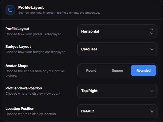
Every layout also decides how your avatar is cropped. Picking a layout starts it on the shape that layout was designed around; the Avatar Shape control right below changes it from there.
| Shape | What you get |
|---|---|
| Round | A circle. The starting point for every layout except Elevated. |
| Rounded | A square with generously rounded corners — soft, but still clearly a tile. |
| Square | A tile with a small corner radius. |
Elevated has no Round
Elevated lifts the avatar above the top edge of the card as a raised tile. A circle has no corners to lift, so that layout offers Square and Rounded only, and starts on Square.
Sidebar layout
Wider layouts can place part of the content in a sidebar next to the main card instead of stacking everything vertically. This suits profiles with several widgets — the widgets sit beside the card rather than pushing your links down.
Check the mobile view
Most of your visitors are on a phone. A layout that looks balanced on a desktop can collapse into a very long scroll on mobile — open your profile on your phone before you settle on an arrangement.
Profile card
The Profile card card sets the material of the card, an optional highlight panel inside it, its border and its shadow.
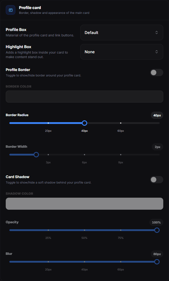
Profile Box
The material of the card and of your link buttons.
| Option | What it does |
|---|---|
| Default | The original card look — no preset applied. |
| Ghost | A transparent box with no borders or effects. |
| Frosted | A glass effect with subtle blur and transparency. |
| Glass | A clearly see-through glass pane with a light edge. Card Opacity only tints the surface, so text and widgets stay readable. |
| Simple | Subtle box with a soft glow effect. |
Highlight Box
Adds a panel inside the card so the content stands out from the background.
| Option | What it does |
|---|---|
| None | No highlight box. |
| Blur | Blurred panel behind the content. |
| Container | Bordered panel behind the content. |
Profile Border
Switch it on to draw a border around the card. Border Color picks its colour, Border Radius rounds the corners from 0 to 80px (snap points at 20, 40 and 60px) and Border Width sets the thickness from 0 to 12px (snap points at 3, 6 and 9px). Border Radius also shapes the card when the border itself is off.
Card Shadow
Switch it on for a soft shadow behind the card. Shadow Color picks its colour, Opacity runs from 0 to 100% (snap points at 25, 50 and 75%) and Blur from 0 to 80px (snap points at 20, 40 and 60px). A dark shadow on a dark background barely shows — a coloured one reads as a glow.
Profile chat
Profile chat adds a comments button to your public profile. The list decides where it sits:
| Option | What it does |
|---|---|
| Off | Do not show the comments button |
| Top right | Button in the upper-right corner of the page |
| Bottom left | Button in the lower-left corner of the page |
| Bottom right | Button in the lower-right corner of the page |
How the comments work
- Visitors have to sign in to write; anyone can read.
- A comment is up to 500 characters. Replies stay one level deep — replying to a reply attaches it to the original comment.
- Anyone signed in can give a comment a heart, and the list can be sorted by Newest first, Oldest first or Most liked.
- As the profile owner you can pin up to 3 comments and delete any comment on your profile. Authors can delete their own.
Pick a corner the rest of your page leaves free — for example not the corner where the volume control or the view counter sits.
Hide tooltips
The Profile Layout card holds Hide tooltips: a list of the hover labels your profile is allowed to show. Tick the ones that stay hidden — UID on the avatar, Badges names, Links titles and the copy confirmation, Location, Join date, Views and Signatures.
Hiding a tooltip hides only the label on hover; the thing itself stays on the card. This replaced the old single Hide UID switch, which is why an older profile starts out with just the UID hidden.
What belongs above the fold
The first screen should carry your name, avatar and the one or two links that matter most. Everything else — widgets, embeds, a long bio — can live below.